
Godaelli Psychiatry& Mental Health Center
Care, thoughtfully practiced.
Serving Virginia · Maryland · Washington, D.C.
Section 01
Brand overview
1.1 — Mission
To make personal, evidence-based psychiatric care something people can actually reach — delivered with the time, attention, and follow-through that recovery requires.
Godaelli Psychiatry & Mental Health Center is an outpatient psychiatric practice serving Virginia, Maryland, and Washington, D.C. We provide medication management and psychotherapy for adults and adolescents, in person and by telepsychiatry, built around a simple conviction: good psychiatric care is a relationship, not a transaction.
Every touchpoint — a referral letter, an appointment reminder, a waiting-room sign — should feel calm, competent, and unhurried. When in doubt, choose the quieter option.
1.2 — Brand personality
Warm, not soft
We speak like a person, not a portal. Warmth shows up as plain language and patience — never as slogans about wellness.
Credible, not cold
Clinical rigor underpins every word. We never trade accuracy for comfort, and we never dramatize diagnosis.
Steady
Calm, consistent, unhurried. The brand never shouts, discounts, or urges. Generous white space is part of the voice.
Attentive
Care lives in details and follow-through: the confirmed appointment, the returned call, the correctly spelled name.
1.3 — Care pillars
- 1
Personalized treatment
Medication management and psychotherapy planned around the person — their history, goals, and life — not around a template.
- 2
Whole-person psychiatry
We treat the biological, psychological, and social together, because symptoms rarely arrive one at a time.
- 3
Accessible care
In-person and telepsychiatry visits across Virginia, Maryland, and Washington, D.C., with scheduling that respects working lives.
- 4
Continuity & trust
The same clinician over time. Progress in mental health is cumulative; so is trust.
1.4 — Who we speak to
Section 02
Logo system
2.0 — Primary lockup

The mark
Seven colored forms gather in a quiet circle inside a human profile: a mind made of many parts, held in balance. The profile line is drawn in Godaelli Purple. The mark is supplied as finished artwork — always reproduce it from the files in this kit; never redraw, retrace, or rebuild it.
The wordmark
A classical serif sets “Godaelli Psychiatry” in Godaelli Purple with the descriptor “& Mental Health Center” in Wordmark Grey. The two lines are a fixed relationship — do not reset, respace, or restack them, and do not typeset the name in Lora as a substitute.
2.1 — Variants
2.1a Primary · full color
Default for all uses on white or near-white fields.

2.1b Reversed
White lockup on Deep Purple or Godaelli Purple fields.

2.1c Monochrome purple
One-color print, engraving, embossing, fax-grade documents.
2.1d Monochrome white
On photography or any dark field where color would compete.
2.1e Icon only
Small spaces where the name appears nearby in text.

2.1f App icon · solid
Patient portal and app stores. White mark centered on Godaelli Purple.
2.1g App icon · light
Social avatars and favicons at 48 px and above.
2.2 — Clear space
Keep a margin of × — the full height of the profile mark — clear on all sides of the lockup. Nothing enters this zone: no type, rules, imagery, or page edge. When space allows, give more.
2.3 — Minimum sizes
Full lockup · min 120 px / 32 mm wide
Below this width the descriptor line becomes illegible — switch to the icon.
Icon · min 28 px / 8 mm tall
Below this height the seven forms merge — use the solid app icon instead.
2.4 — Misuse
The lockup is never altered. If a layout seems to demand any of the following, the layout — not the logo — should change.
2.5 — Secondary marks
Two companion marks extend the identity where the primary lockup would be too formal or too small. Both are supplied artwork — never redrawn, recolored, or combined with the lockup on the same surface.

2.5a The stamp
Circular seal with the practice name set around the profile. For social posts, stationery corners, and stickers; minimum 96 px / 26 mm diameter.

2.5b The butterfly
The practice mascot, drawn in the spectrum palette. Reserved for patient-facing warmth — worksheets, adolescent materials, waiting-room graphics. Never a substitute for the logo.
Section 03
Color palette
3.1 — Core palette
Godaelli Purple
Primary. The profile line, headings, links, and identity color.
- Hex
- Hex
- RGB
- RGB 102 · 47 · 142
- CMYK
- CMYK 28 · 67 · 0 · 44
Deep Purple
Depth: display headers, reversed fields, covers.
- Hex
- Hex
- RGB
- RGB 74 · 31 · 102
- CMYK
- CMYK 27 · 70 · 0 · 60
Aubergine Ink
Body text. Softer than black, still fully legible.
- Hex
- Hex
- RGB
- RGB 43 · 27 · 51
- CMYK
- CMYK 16 · 47 · 0 · 80
Paper White
The dominant print surface. White space is a brand asset.
- Hex
- Hex
- RGB
- RGB 255 · 255 · 255
- CMYK
- CMYK 0 · 0 · 0 · 0
Warm White
The digital field — site backgrounds and long screens.
- Hex
- Hex
- RGB
- RGB 251 · 248 · 243
- CMYK
- CMYK 0 · 1 · 3 · 2
Wordmark Grey
The descriptor line only. Never for body text.
- Hex
- Hex
- RGB
- RGB 179 · 178 · 179
- CMYK
- CMYK 0 · 1 · 0 · 30
3.2 — Proportion
3.3 — Spectrum accents
Seven accents, sampled directly from the seven forms of the mark. Use them sparingly — one or two per piece, at full strength, never tinted or blended. Marigold and Teal are graphic colors only; see the contrast table before setting any text.
Iris
Charts, links on light tints
Cobalt
Data, secondary accents
Teal
Graphic use only
Forest
Confirmation states, charts
Marigold
Graphic use only
Magenta
Emphasis, misuse marks
Sienna
Editorial accents
3.4 — WCAG 2.1 contrast
Every approved text pairing, measured. Normal text requires 4.5:1 (AA) or 7:1 (AAA); large text — 18 pt and above, or 14 pt bold — requires 3:1 (AA) or 4.5:1 (AAA).
| Sample | Foreground / background | Ratio | Normal | Large |
|---|---|---|---|---|
| Aa | Aubergine Ink on Paper White | 16.1 : 1 | AAA | AAA |
| Aa | Deep Purple on Paper White | 12.5 : 1 | AAA | AAA |
| Aa | Godaelli Purple on Paper White | 8.9 : 1 | AAA | AAA |
| Aa | Aubergine Ink on Warm White | 15.2 : 1 | AAA | AAA |
| Aa | Deep Purple on Warm White | 11.8 : 1 | AAA | AAA |
| Aa | Godaelli Purple on Warm White | 8.4 : 1 | AAA | AAA |
| Aa | Paper White on Aubergine Ink | 16.1 : 1 | AAA | AAA |
| Aa | Paper White on Deep Purple | 12.5 : 1 | AAA | AAA |
| Aa | Paper White on Godaelli Purple | 8.9 : 1 | AAA | AAA |
| Aa | Iris on Paper White | 10.3 : 1 | AAA | AAA |
| Aa | Sienna on Paper White | 8.2 : 1 | AAA | AAA |
| Aa | Cobalt on Paper White | 7.1 : 1 | AAA | AAA |
| Aa | Forest on Paper White | 6.2 : 1 | AA | AAA |
| Aa | Magenta on Paper White | 5.1 : 1 | AA | AAA |
| Aa | Paper White on Magenta | 5.1 : 1 | AA | AAA |
| Aa | Aubergine Ink on Marigold | 6.3 : 1 | AA | AAA |
| Aa | Aubergine Ink on Teal | 5.5 : 1 | AA | AAA |
| Aa | Teal on Paper White | 2.9 : 1 | FAIL | FAIL |
| Aa | Marigold on Paper White | 2.6 : 1 | FAIL | FAIL |
Ratios computed per WCAG 2.1 relative luminance. Pairings marked FAIL are approved for non-text graphic elements only (3:1 minimum for UI components applies).
Section 04
Typography
4.1 — Typefaces
Lora
Display serif. Section titles, statements, card titles, and every italic emphasis. Never letterspaced, never set in all caps.
- Role
- Serif · display
- Weights
- 400 · 500 · 600 + italic
- Notes
- Fallback: Fraunces
Inter
Body sans. Running text, captions, forms, and interface copy. Carries all long-form reading; regular weight by default.
- Role
- Sans · body
- Weights
- 400 · 500 · 600
- Notes
- Fallback: system sans
IBM Plex Mono
Technical voice. Eyebrow labels, section numbers, data values, and running footers. Always uppercase with wide tracking.
- Role
- Mono · labels
- Weights
- 400 · 500
- Notes
- +0.12–0.22 em tracking
4.2 — Type scale
Seven steps cover every document the practice produces. Sizes are quoted at their print size on US Letter and set here at their screen equivalent; do not introduce intermediate steps.
| Specimen | Style | Font | Size / lead | Use |
|---|---|---|---|---|
| Godaelli Psychiatry | Display | Lora 500 | 34 / 40 | Section titles, cover |
| Care, thoughtfully practiced. | Headline | Lora 400 | 22 / 34 | Statements, pull quotes |
| Personalized treatment | Title | Lora 400 | 16 / 22 | Card & subsection titles |
| Good psychiatric care is a relationship, not a transaction. | Body | Inter 400 | 10.5 / 18 | Running text |
| Below this width the descriptor becomes illegible. | Caption | Inter 400 | 9.5 / 15 | Annotations, tile captions |
| 1.2 — Brand personality | Label | Plex Mono 400 | 8.5 / 13 | Eyebrows, data, caps |
| Footer | Plex Mono 400 | 8 / 11 | Running footers |
4.3 — Setting rules
Italic emphasis
Within body copy, emphasis is a single italicized keyword — Lora italic in Deep Purple. At most one per paragraph; never bold, never underline.
Case & tracking
Uppercase and letterspacing belong to Plex Mono alone. Lora and Inter are always set in sentence case at natural spacing.
Numbers
Section and page numbers are zero-padded mono figures — 01 through 07 — separated by the interpunct (·), never the slash.
Section 05
Voice & tone
5.1 — How we sound
We write the way a good clinician speaks: plainly, without hurry, and with respect for what the reader may be carrying.
Many of our readers meet us on a hard day. Copy that performs enthusiasm — exclamation marks, countdowns, congratulations — reads as pressure. The brand voice removes pressure: it states what happens next, who to call, and what to expect, in that order.
Clinical language is welcome when it is accurate and explained. We name conditions and treatments plainly rather than gesturing at “wellness”; euphemism creates more anxiety than the words it avoids.
5.2 — Principles
- 1
Plain first
Short sentences, common words. Medical terms are explained on first use — never avoided, never left to intimidate.
- 2
Specific over soothing
A date, a name, and a next step reassure more than any adjective. When we want to comfort, we add detail, not warmth-words.
- 3
Unhurried
No urgency, no scarcity, no exclamation marks. The reader sets the pace of their own care; our copy holds the door open.
- 4
Honest about uncertainty
Treatment takes adjustment, and we say so. Confidence lives in the process — follow-up, review, change of course — never in guarantees.
5.3 — Do / don't
Paired examples from the practice's most common touchpoints. The left column is the voice; the right column is what it must never become.
Website — describing care
Do
“We provide psychiatric evaluations, medication management, and psychotherapy for adults and adolescents — in person or by video.”
Don’t
“Transform your mental wellness with our holistic healing solutions for mind, body, and spirit.”
Appointment reminder
Do
“Your telehealth appointment is Tuesday, March 4 at 2:00 PM. Reply C to confirm, or call us to reschedule.”
Don’t
“Don’t forget!! Your wellness journey continues tomorrow — see you there!!!”
New-patient welcome
Do
“Before your first visit, we’ll ask for your medication list and insurance card. If anything is unclear, call us — a person answers.”
Don’t
“Congratulations on taking the first step toward a brand-new you! Spots fill fast, so book now.”
Talking about treatment
Do
“Finding the right medication can take a few adjustments. We review how you’re doing at every visit and change course together.”
Don’t
“Our proven system beats depression and anxiety once and for all — guaranteed results in 30 days.”
Section 06
Imagery & brand elements
6.1 — Photography
Photography shows ordinary life, honestly lit — people with agency, not illustrations of distress.
- 1
Natural light
Daylight interiors and soft shadow. Never the blue-white glare of clinical stock, never dramatic chiaroscuro.
- 2
Real settings
Homes, offices, sidewalks, and consult rooms that could plausibly be in Virginia, Maryland, or D.C. — not seamless studio backdrops.
- 3
Agency, not despair
Subjects are mid-activity — reading, commuting, in conversation. Never head-in-hands, never staring through rainy windows.
- 4
Quiet grade
Neutral, slightly warm color. Purple may appear in wardrobe or environment; it is never applied as a duotone or wash.
- 5
Nature as respite
Gardens, tree canopies, water, open sky — stillness that reads as calm and recovery. Real, reachable places; never screensaver sunsets or misty mountaintops.
6.2 — The petal frame
The petal — three round corners, one square — echoes the seven forms of the mark. It frames color swatches and small crops. Radii 50 / 50 / 50 / 4; the square corner sits bottom-left; one petal shape per composition.
Do
Frame a color swatch, a small photo crop, or one highlighted figure. One petal per composition, square corner at bottom-left.
Don’t
Rotate it, outline it, tile it as a pattern, or set type inside it.
Section 07
Applications
7.1 — Business card
7.1a Front · 3.5 × 2 in
Primary lockup centered on Paper White. Nothing else prints on the front.
Jane Doe, MD
Board-certified psychiatrist
(000) 000 · 0000
godaellimentalhealth.com
7.1b Back · Deep Purple
White icon top-left; contact block bottom-left in Plex Mono. Name in Lora, 10 pt minimum.
7.2 — Email signature
John Roe, PMHNP-BC
Psychiatric Nurse Practitioner · Godaelli Psychiatry & Mental Health Center
(000) 000 · 0000 · godaellimentalhealth.com
Icon at 44 px, name and credentials — MD, DO, PMHNP-BC — in Lora, details in Inter, contact line in Plex Mono. Mail clients without web fonts substitute Georgia / Arial / Courier New — acceptable, never faked with images of text.
No banners, quotations, or confidentiality essays below the block. A one-line HIPAA notice may follow in 8 pt grey where policy requires it.
7.3 — Social avatars
7.3a Profile · solid
Default avatar everywhere. White icon centered at 55% of the circle.
7.3b Profile · light
Where the platform frame is dark, or beside heavy purple content.
7.3c Favicon · 32 / 16 px
Solid app-icon format only; the full-color mark is illegible at this size.
7.4 — Social posts
Feed templates rotate the three brand fields — Deep Purple, Warm White, and photography under a purple scrim. Lora carries the message with a single italic keyword; Plex Mono sets the series label top-right and the footer rule with the practice name and URL.
Clinical insight“Panic attack” and “anxiety attack” aren’t the same thing.
And the difference changes what helps.
7.4a Quote · 1200 × 1200
Deep Purple field, white Lora, one Marigold keyword. Reversed logo.
Worth knowingDepression doesn’t always look like crying.
- Snapping at people you love
- Tired no matter how much you sleep
- Feeling nothing at all
- Losing interest in everything
- Aches with no clear cause
7.4b Checklist · 1080 × 1350
Warm White field, Marigold arrows, full-color logo, aubergine text.
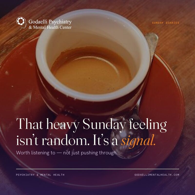 Sunday scaries
That heavy Sunday feeling isn’t random. It’s a signal.
Worth listening to — not just pushing through.
7.4c Photo · 1080 × 1080
Photography under a Deep Purple scrim; white logo and type hold contrast.
Sunday Scaries · 1/4What the Sunday Scaries are telling you.
Three root causes worth paying attention to.
Swipe →
Sunday Scaries · 2/4Cause 1
The job itself
Dread that lifts by Monday afternoon is often pointing at the work — not at you.
Sunday Scaries · 3/4Cause 2
An anxiety pattern
If Sunday dread bleeds into most evenings, it may be more than the calendar.
Sunday Scaries · 4/4Cause 3
A values gap
Sometimes it’s honest data: the week ahead doesn’t fit what matters to you.
Worth talking through? We’re here.
7.4d Carousel · 1080 × 1350 × 4
Dark cover, light middle slides, dark or light close with the single Marigold CTA pill. One idea per slide; slide count top-right in the series label.
End of Edition 01
Section A
For AI tools
A.1 — The brief
Staff drafting social posts with an AI assistant can hand it this address. It returns the whole brand system as plain text the assistant can read — written for machines, generated from the same data as this website, so the two can never drift apart.
Paste this into your assistant
What it contains
- The hard rules — no exclamation marks, no guarantees, no invented practice details
- Voice principles and the do / don’t examples from §5.3
- All four post templates with their dimensions, fields, and type treatment
- Every hex value, plus which pairings fail text contrast
- Logo file URLs, variants, clear space, and minimum sizes
- Photography direction and the “never” list
- A pre-publish checklist the assistant reports against
Also published
/llms.txt — the conventional index assistants look for on their own. It points at the brief, so a tool that fetches this site without being told where to look still finds the rules.
Both are plain text and open in a browser. Nothing is behind a login, so any assistant that can read a web page can read them.
A.2 — A prompt to start from
Pointing an assistant at the brief is not enough on its own — tell it to follow the brief and to report back against the checklist. That last instruction is what turns the rules into something you can actually check.
Read https://brand.godaellimentalhealth.com/social.md and follow it exactly.

Draft an Instagram carousel (7.4d, four slides) about the difference between
burnout and depression. Give me the copy for each slide, the field colour and
logo variant per slide, and the series label. Then run the pre-publish
checklist in section 9 and tell me anything you could not satisfy.
A.3 — Before anyone uses it
Not yet configured
The brief is missing a public phone number, social handles, crisis-line wording, a standing disclaimer. Until these are filled in, it instructs assistants to ask rather than guess — so drafts will come back with gaps instead of a plausible invented phone number or handle. Set them in app/lib/brand.ts under PRACTICE.